Design Smarter: Best Practices for School Newsletter Layout and Readability

☕️ TL;DR:
- 📐 Keep it simple. Use sections, headlines, and white space.
- 🖼️ Show more, say less. Visuals > paragraphs.
- 🔡 Font matters. Stick to 1-2 legible fonts. Sans serif = better for screens.
- 🌈 Use color wisely. Highlight sections or themes, not the whole rainbow.
- 🔁 Make it scannable. Lists, bold text, and short blocks rule.
- 📊 Track what works. Check your open and click rates to tweak what’s next.
Ever squinted at a school newsletter that looked more like a novel than a message? 🥴
If your school newsletter isn’t getting read, it may be a design problem. Let’s fix that with mobile-first layout tips that make your updates easy to read and hard to ignore.
Families don’t need more info—they need the right info, laid out in a way that’s clear, scrollable, and maybe even delightful. With most school newsletters read on a phone (while someone’s waiting in a pickup line), smart design isn’t a “nice to have.” It’s a must.
Let’s make it easy:
Newsletter Design Tips to Improve Family Engagement
1. Structure First, Style Second
Think of your newsletter like a well-organized backpack. Everything should have its place. Use clear headers (like “Upcoming Events” or “From the Principal”) so readers can skim and jump to what matters most.
Pro Tip: Front-load your content. Families might not scroll all the way down, so lead with what’s urgent or exciting.
2. Say it with Pictures
Visuals do more than decorate. A good photo can tell a story and save you 100 words.
- Sharing a classroom update? 📸 Include a photo of students in action.
- Promoting a food drive? 🍎 Use a simple graphic with dates and drop-off info.
Bonus: Images make your newsletter more engaging on mobile.
3. Cut the Clutter
Think of this as “Marie Kondo-ing” your newsletter. Keep what sparks joy—and delete the rest.
- Turn a paragraph into a headline + bullet list.
- Use bold or italic for key points (but sparingly!).
- Replace explanations with links (“See full schedule here” instead of 3 sentences).
4. Use Title Hierarchy to Guide the Eye 👀
In Smore, your font choices are simple—but your layout still speaks volumes. When families open your newsletter (likely on their phone), they’re scanning first—reading second. That means your title choices matter more than ever.
Here’s how to design for readability:
✅ Do:
- Use different title sizes to signal section importance.
- Start each new section with a clear, skimmable headline.
- Bold key info like dates, deadlines, or calls to action.
🚫 Don’t:
- Rely on long paragraphs to tell your story. Break them into smaller chunks.
- Make every section look the same—your readers won’t know where to focus.
- Center-align whole sections (it’s harder to read on mobile).
📱 Bonus Tip: Think “screen first.” Most families will view your newsletter on a phone, so keep it scannable, snackable, and scroll-friendly.
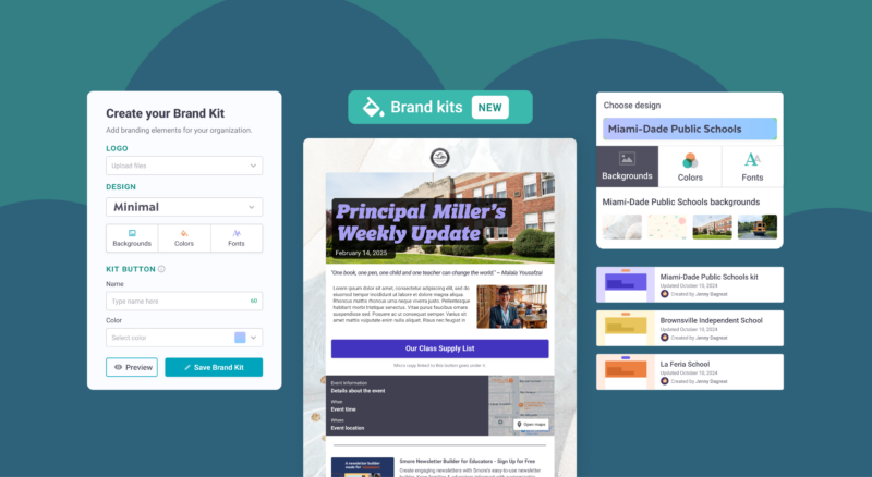
5. Let Your Design Reflect Your Vibe
Your newsletter should feel like you. Whether you’re playful, classic, or all about emojis 🎉—match your layout to your school’s tone.
Smore templates make this easy by giving you on-brand options that work on every screen. Pick a theme, set your brand colors, and you’re good to go.
Final Thoughts
The best newsletters aren’t just pretty—they’re purposeful. They help your community stay connected, informed, and even a little inspired. When you design with care, your message shines through.
Ready to try these layout tips?
Your next update doesn’t have to be a wall of text. Smore makes it easy to craft scroll-friendly, eye-catching newsletters that get read and remembered. Start designing today, or schedule a demo to see how Smore can power communication for your whole school or district team.
FAQ 🧐
What’s the best length for a newsletter?
Should I include the whole message in the email or link to Smore?
What if I have to include a lot of info?
How do I know if families are reading it?