
BALANCE
Balance is all around us. Take a look at your home; you can probably see balance there too. Balance is having the same amount of 'stuff/weight' on two sides. Imagine the picture or room or whatever being on a scale; you want both sides to balance out. This doesn't necessarily mean that the objects are the same; you could have one big object and a couple smaller objects, or any other combination. Balance makes a picture or real life more soothing and easy to look at. We try to balance stuff without even knowing it. Balance brings a flow and a certain type of neatness that our unconscious brains look for.

Not so balanced
This picture is a pretty bad picture. It doesn't follow any rule really. If it had followed the rule of thirds than it could have at least looked better but because it isn't, it's really easy to see how off balance it is. There is a lot of negative space on the right side because all the 'weight' is on the left side.

Exception to the rules
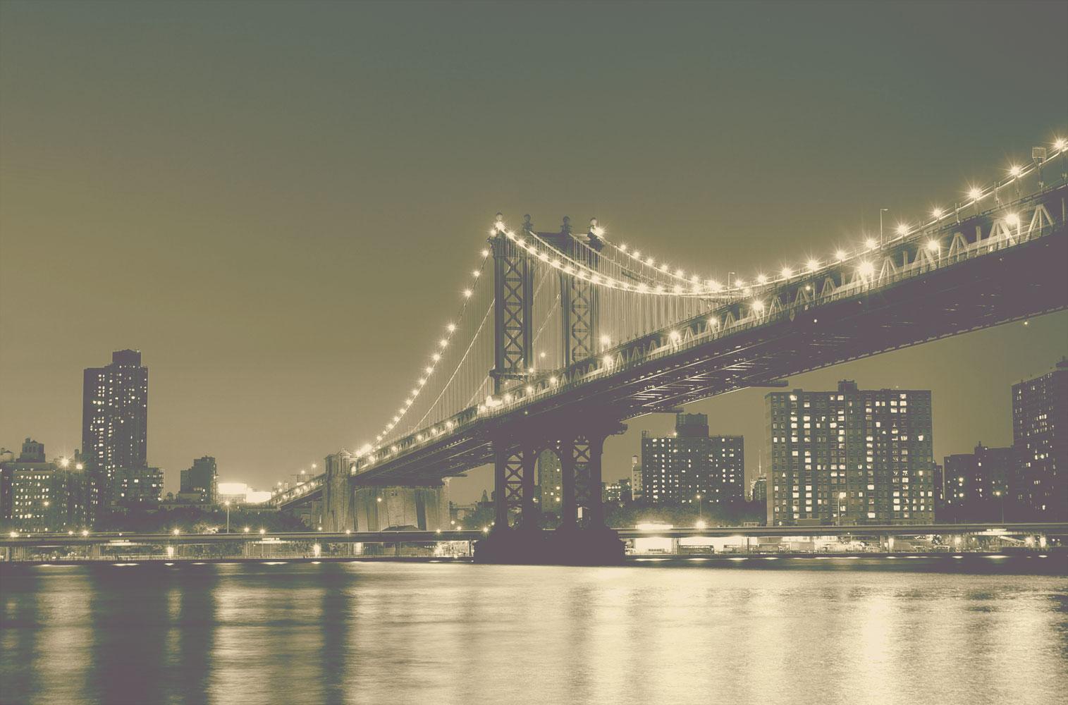
This picture isn't balanced but it works. It follows the rule of thirds and the golden ratio so the picture is still a very eye catching picture.

Perfect balance
This picture is actually really well balanced. See the King standing in a dominate position in the left near the front and the smaller pawns standing in a submissive but protective position in the back? There is more pawns than Kings but because of the positioning and sizes it works perfectly.

Advanced balance
Balance is something we all use in a daily basis but there are some little tricks that can help you use balance even better. Did you know that there is something called colour balance? It's using 'dominate and sub dominate' colours. You would have more of the sub dominate colour (light colours like white and sky blue) and use less dominate colours (dark colours like black and ruby red.) For example you could have a light green background and have a (smaller) dark red rose near the front; the flower could have the focus and the background could be blurry. This would balance because dark colours 'weigh' more than light colours; so when you have more light colours than dark colours it balances out.