Tricks and Tips of Photoshop
By: Andrea Arce
Photoshop's beginnings
It began in 1987 , when Thomas Knoll , a Ph.D student , began to write a programming code that would display grayscale images on a monochrome display . This developed the program to be named "ImagePro" ,but was later changed to photoshop in March 1988.
What is Photoshop? and why use it?
- Photoshop is a software invented to edit the mistakes or enhance the pictures certain elements.
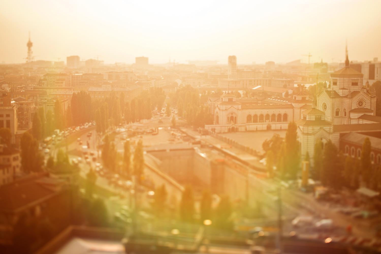
- a reason to use photoshop is badly adjusting a photo while taking it is a poor photograph. this program helps me try to hide out of focus subjects with excessive sharpening or to compensate for extreme underexposure or overexposure often ends in images lacking details.
Why ever choose photoshop?
- It’s an area that really interests me artistically; this would be a learning stepping stone and would teach me the fundamentals of photography and Photoshop as a career choice .
- However for another individual Photoshop is a great way to advertise other products like cosmetics and magazines .
First steps...
In my Independent study I decided to stick to trust worthy sources to learn about this kind of software. So , I first read through the manual of Adobe Photoshop CS6 and read and saw tutorials on workspace and how it all works.
http://helpx.adobe.com/photoshop/topics.html
First lesson
I learned there are different types of work spaces to choose ,however there are all for certain types of styles to Photoshop . There is also an option to make your new workspace based on your needs and likes
Zoom in and keys
Press ALT and click -Zoom out
click-Zoom in
Ctrl+Alt+z -Undo
click-Zoom in
Ctrl+Alt+z -Undo
saving files
You can automatically save files if you go through preferences, click on file handling and select automatically save every _________ minutes or etc.
Adjustments keys and names
Brightness and Contrast
Levels- can move and stretch the brightness levels of an image
Curves-affects light's two primary influences: tones and contrast
Vibrance - Adjusts the saturation so that clipping is minimized as colors approach full saturation
Exposure - Offset and Gamma Correction. I am interested only in the Exposure slider, ignoring the other two. It seems like it tries to simulate the behavior of exposure value of a camera
Hue- color choice
color balance - the amount of intensity given to each color
Black and white
Threshold
Gradient map
Invert - reverse the color
Examples of my work:
Original
First Photoshop
- I first brightened the corner with the layer curves 1
- Then pressing exposure 1, I changed the gamma correction and set it higher to 0.16
- I lastly used hue ,channel mixer, and color balance 1 to make the corner green and flowers on the edge of the paper have a little color on them
- First the brightness is lowered and contrast is placed higher.
- threshold is added to make the picture/image black and white
- Finally levels 1 and 2 were added so the trees and grass or small details can have more black and clarity.
Before
After
- First I added hue/saturation
- The Vibrance was added and it made the water brighter and with lighter colors
- I added invert to turn the colors inside out (water used to be the body color now but they exchanged so the body became lighter and waves darker)
- Levels were finally added and it made the background darker
Before
After
- Brightness and contrast were added to make the original picture darker
- Then threshold is added and it makes the picture black and white
- Finally a level is added to show the hands and arms
Before
After
- Hue/saturation was added and it made the whole image to a salmon color
- Posterize and Vibrance were also added and it made the shadow of the egg and the white dots and left over makings in the background
- A Level was added and it made the egg darker and darker lines were shown at the bottom of the egg
- Lastly black and white was added to distinguish the egg shells , their mouths , and eyes.
- First brightness and contrast was added to make the picture darker
- then exposure was added and it made the background blurry and less defined by detail
- color balance was then used to add green to part of the background
- Invert was then used to reverse the color of the egg shell from white to black and the egg's color too.
Before
After
- The brightness and contrast made the picture darker on its brightness and have more contrast
- Then black and white was added to the picture
- A Level was also added to make the gray scale a wider darker range
- Finally a gradient map was added and it made the image yellow and blue
Original
After
- Photo filter was added to make the sand colors and etc.
- Finally posterize was used to make the body blurry and look as if its repeating
Next steps
For the future I would like to perfect and master how to layer each picture , so grab different pictures and mold them into one .